A fresh logo might give a brand a new corporate look, but it can spell headaches for car dealers as they face a raft of changes across their business.
From the huge signs on the road side to their letterheads and business cards (remember them?), car dealers must roll their eyes when they see the latest ‘brand identities’ introduced.
But that doesn’t mean car manufacturers don’t love them – and the latest ‘flat design’ language has given them a new excuse to get their fine line pens out.
Flat design has become the most prominent new trend, because complicated logos with shadows, gradients and detailed features don’t look good on screens.
In the digital age, that simply won’t do. And with the car industry experiencing a massive shift towards electric vehicles, switching to a new logo is a great way of modernising a brand and making a statement about your new brand identity. Or so the manufacturers like to think…
Kia
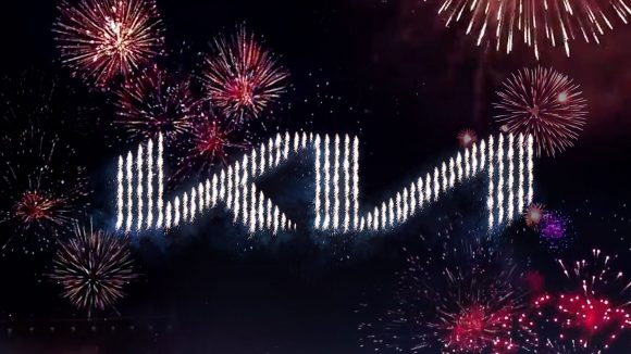
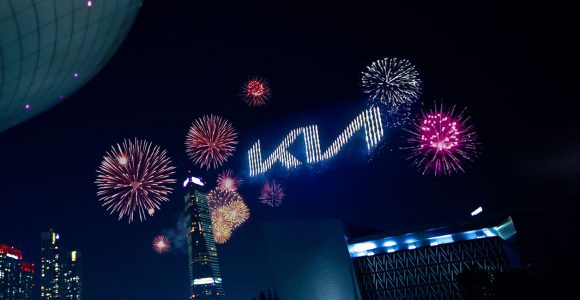
This week, Kia took the wraps off its new look. While it’s still best-known for providing affordable mainstream models, there’s been a definite switch to building more stylish, premium models in recent years.
The new logo is said to represent ‘the company’s commitment to becoming an icon for change and innovation’, according to Ho-sung Song, Kia’s president and CEO.
He added: ‘Our new logo represents our desire to inspire customers as their mobility needs evolve, and for our employees to rise to the challenges we face in a fast-changing industry.’
The rest of the world just wondered why it bending over.
Volkswagen

One of the most prominent logo changes in recent years came from Volkswagen. The automotive giant changed from the 3D-effect logo that’s known the world over, to a much simpler interpretation of the same design with a new dark blue colour scheme.
The move has come at a time when VW is pivoting its business towards building electric models for the mainstream market, and said the new logo marks the ‘start of a new era’.
BMW

Another major German manufacturer to go for the 2D approach was BMW, which saw its traditional roundel reinterpreted with a transparent surround and new font for the digital era.
It plans to continue using the traditional logo on its cars, for the time being at least, using the new logo for communications.
The idea is that it looks good on social media and websites, as well as future-proofing for use in apps and other digital products.
Nissan
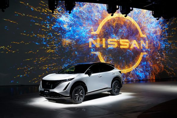
Japanese car maker Nissan took its chrome-effect logo and simplified it this year, keeping the same principle of having the company name centrally located within a circle.
The raised block in the middle is gone, but its spirit remains thanks to two flicks on the end of each line that represents the border. The brand overhaul was intended to make the logo more ‘digital-friendly’.
Audi
Audi was ahead of the trend when it came to flat design, switching its logo up in 2017. The four overlapping rings are an iconic logo, designed to look like metal or chrome.
Little has changed for the new look, with the same four rings now simply losing their 3D effect. Interestingly, Audi used to have a 2D logo, so has returned to its roots.
- Join our breaking news WhatsApp group – Click here to join now
- Car Dealer Podcast – what dealers can and cannot do in lockdown
- Car Dealer Top 100 – the most profitable car dealers in the UK here


